May 2023
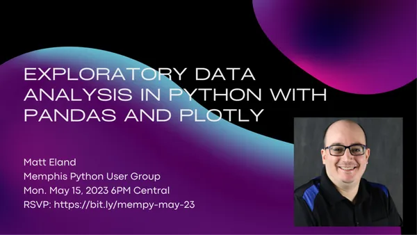
Exploratory Data Analysis with Pandas and Plotly

Let's take a look at how Python can be an effective platform for analyzing and visualizing data.
In this talk we'll use Jupyter Notebooks, Pandas, and Plotly to visualize several datasets to find trends in our data.
We'll cover loading and transforming data in Pandas and NumPy, including cleaning missing values and performing feature engineering. We'll also look into the built-in aggregation and statistical techniques in Pandas DataFrames.
Next we'll take our data and see how Plotly can generate compelling scatter plots, box plots, histograms, tree maps, and more with just a bit of code.
By the time we're done you'll see why I often prefer data visualization in Python over dedicated tools like Tableau or Power BI.
Speaker - Matt Eland
After several decades as a software engineer and engineering manager, Matt now serves as a software engineering instructor and gets to raise up future developers and unleash them upon the world to build awesome things.
Matt is a Microsoft MVP in Artificial Intelligence and a Microsoft Certified Azure Data Scientist and AI Engineer associate. Matt runs several blogs and a YouTube channel on data science and software engineering topics, is currently pursuing a master's degree in data analytics, and helps organize the Central Ohio .NET Developer Group while contributing to local and regional conferences.
In his copious amounts of spare time, Matt continues to build nerdy things and looks for ways to share them with the larger community.
Tags: pandas, plotly, data-viz, meetups
← Back home